
Restaurant Profiles
Showcasing Dorsia restaurants and venues through a scalable and editorial lens
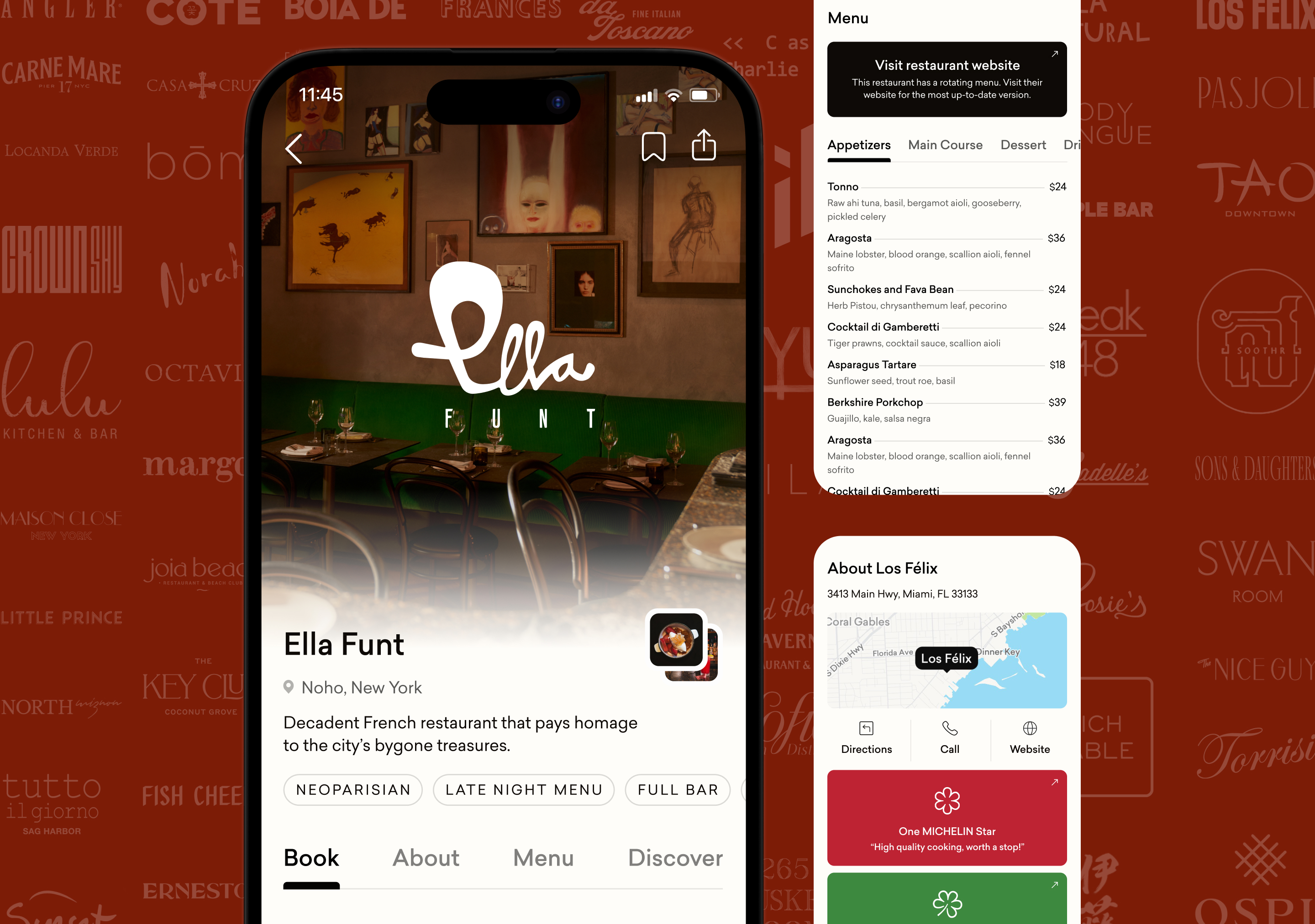
A key touchpoint in the Dorsia user journey, the restaurant profile page showcases branded and logistical details about a venue to prepare members for booking. This project aimed to increase booking velocity through implementing table stakes features like menus and bookmarking, as well as a facelift to the UI of the profile.
Team
- Jenny Liu Zhang, design lead
- Pat White, designer
- Mitchell Hart, designer
- Matthew Rosenberg, product lead
Activities
- Product strategy
- Journey mapping
- User flows
- Prototyping
- Visual design
- Design documentation
- Design QA
Stakeholders
- Dorsia Leadership
- Dorsia Content Team
Timeline
- 6 weeks
 App Store
Creative Process
Unpacking Business Motives
Leaders sought to encourage the growth loop, specifically increasing engagement through browsing and booking inventory.
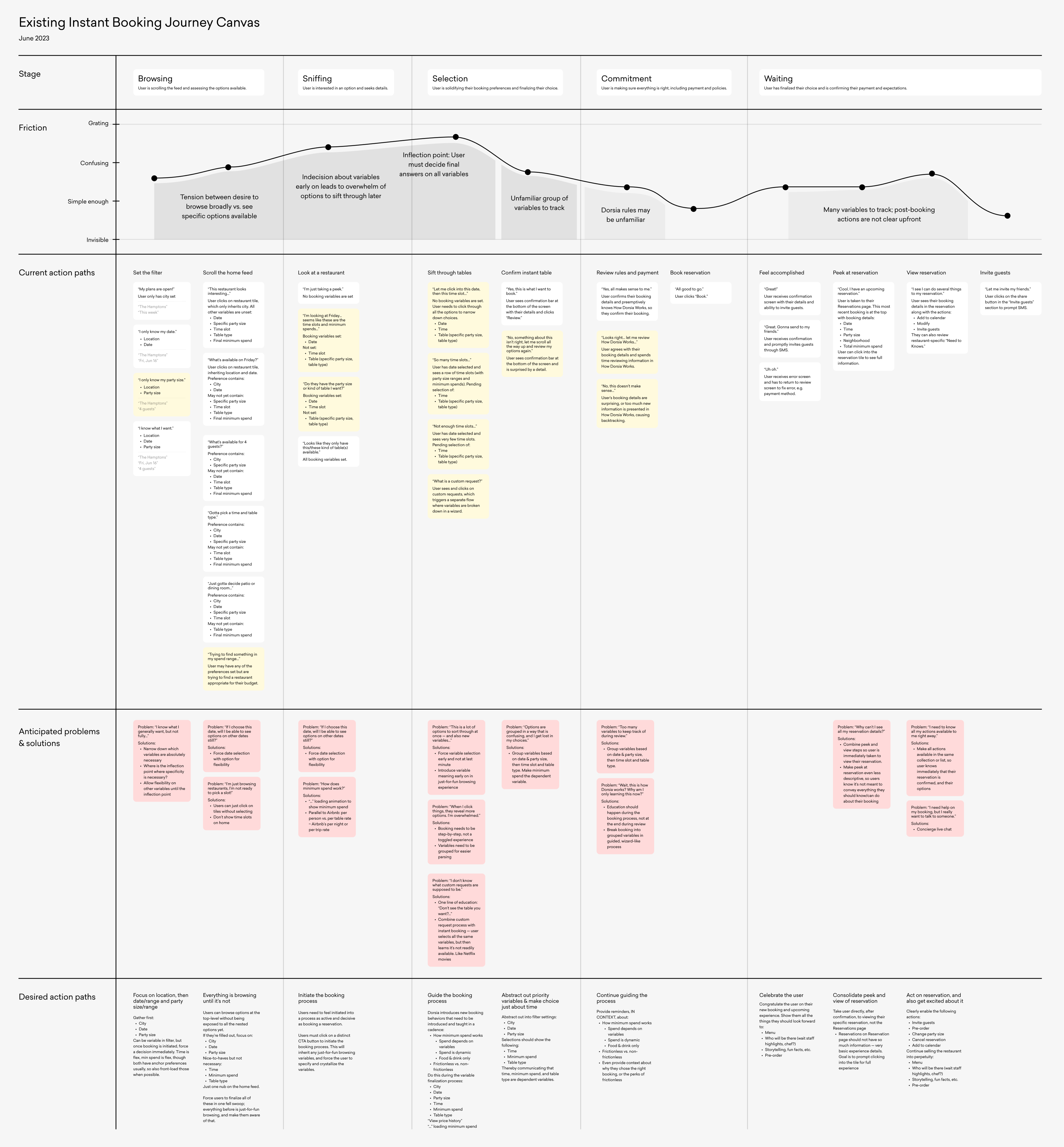
Journey Mapping
Audited user journey through browsing and booking, including friction points, action paths, and user desires.
Problem Framing
The user journey touched inventory display, filtering, and booking conversion. To scope down, we focused on inventory display.
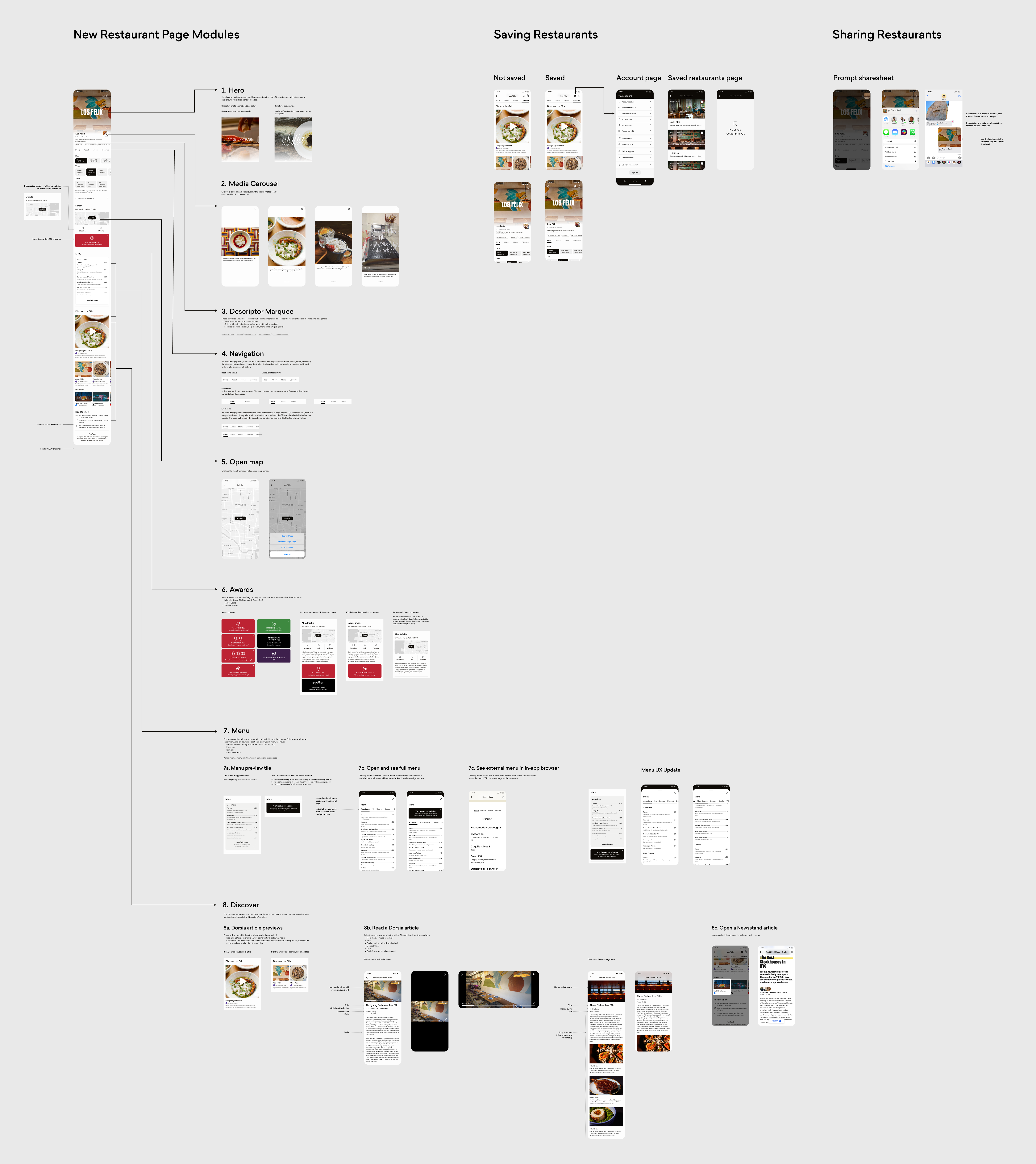
Wireframing for Modularity
Inventory ranged in available information, so restaurant profiles needed to be modular in what they could display.
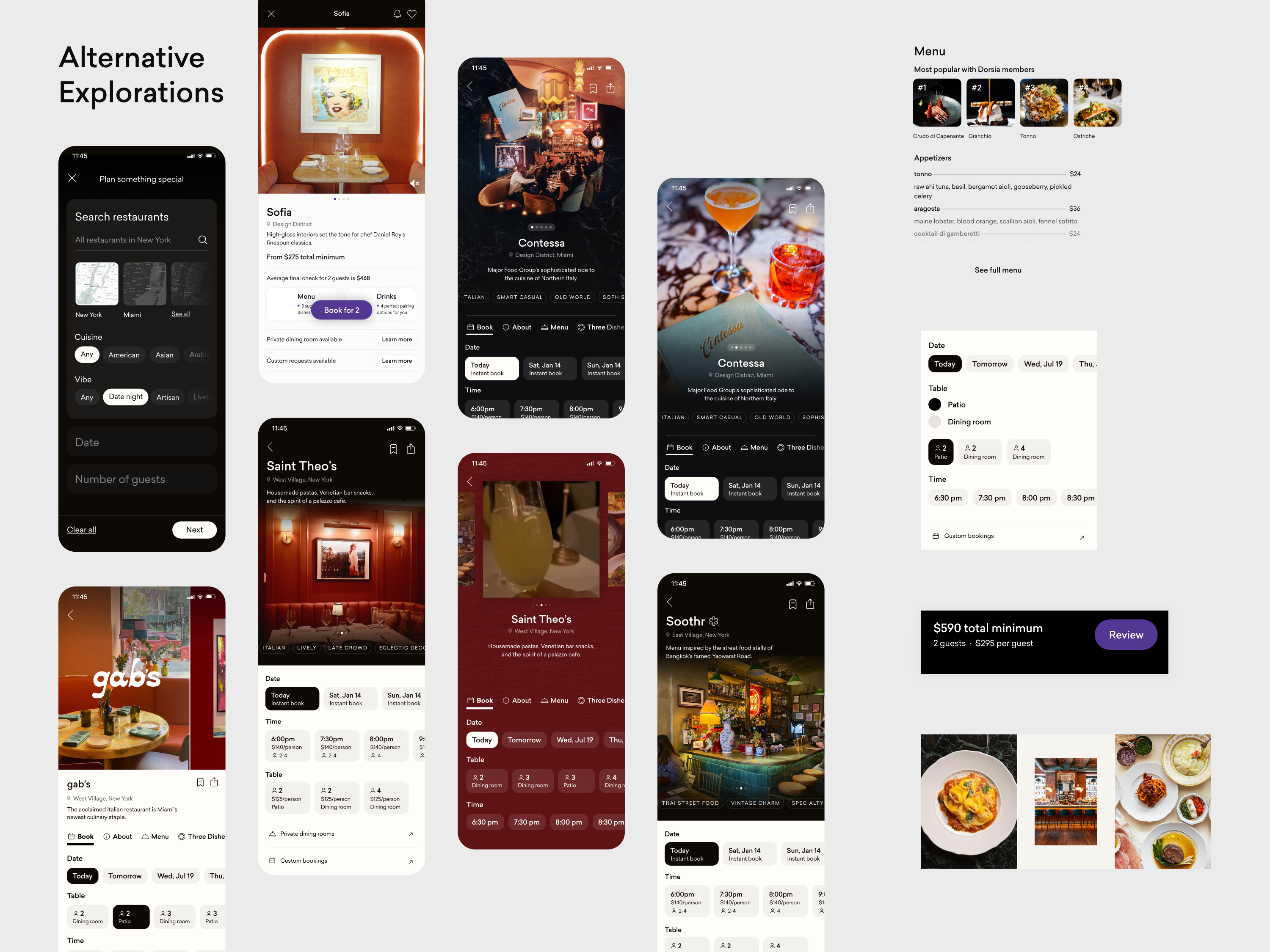
Stylistic Iteration
Within modules, design team iterated on interface solutions that conveyed unique restaurant details and brand perspectives.
Integrating Marketing Functions
A key module was made to natively feature Dorsia content. The overall design was also tested for other purposes, like event profiles.
QA & Feature Launch
Delivered design with rigorous documentation and edge cases. Created feature launch email to promote to new members.
Key Quality
“House of Brands” Aesthetic
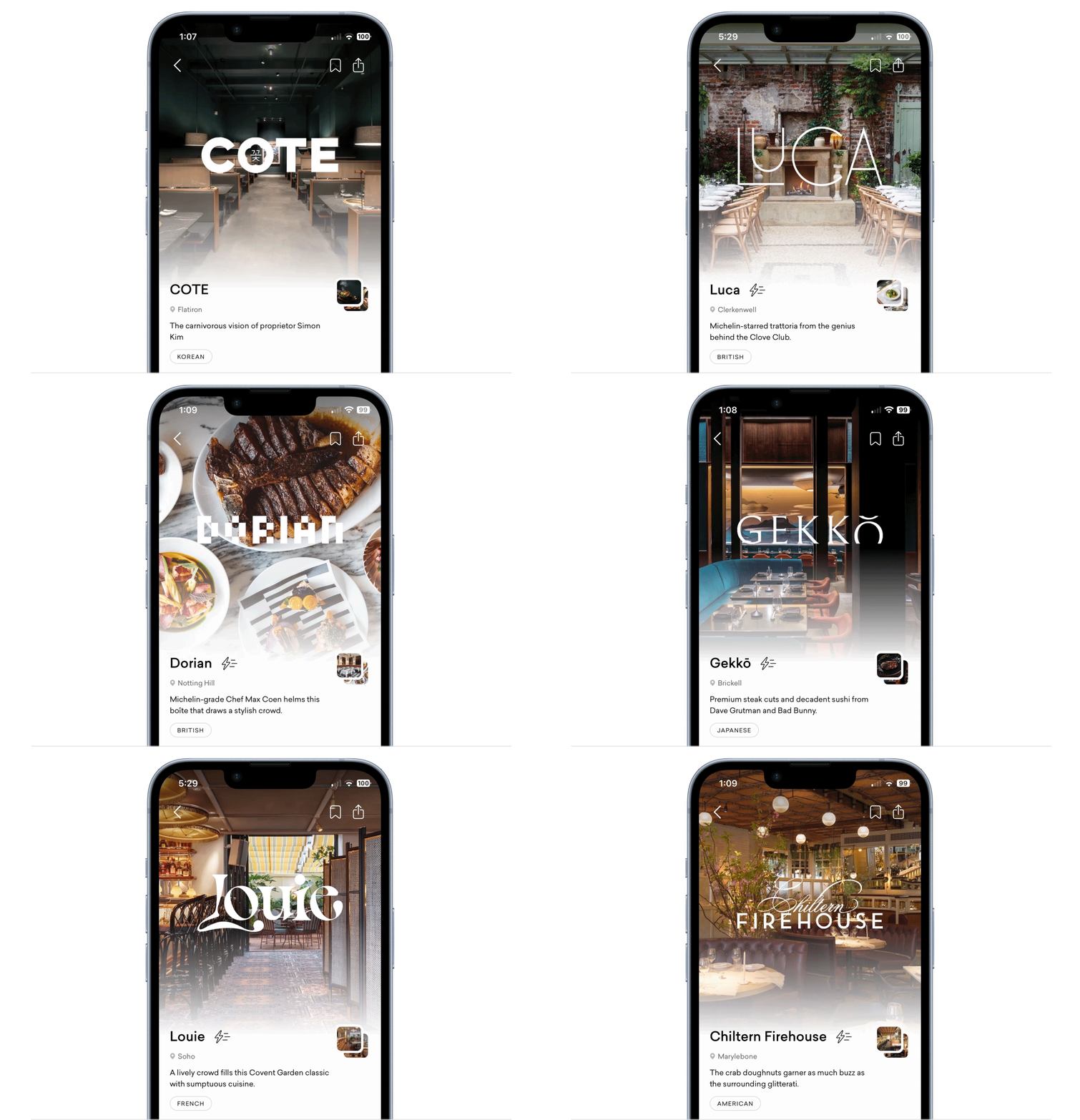
The restaurant profile perfectly captures how Dorsia’s branding allows its venue partners to uniquely shine, but with a subtle Dorsia stamp that ties them all together. In our iterations, we attempted a variety of inventory stylings, from bespoke artwork to cinematic video formats. However, the most scalable option was the most minimalist one: by focusing on the way restaurants are displayed—set on white, snapshot animations, and centered white logos—we were able to achieve a branded look without being too obvious.
Key Quality
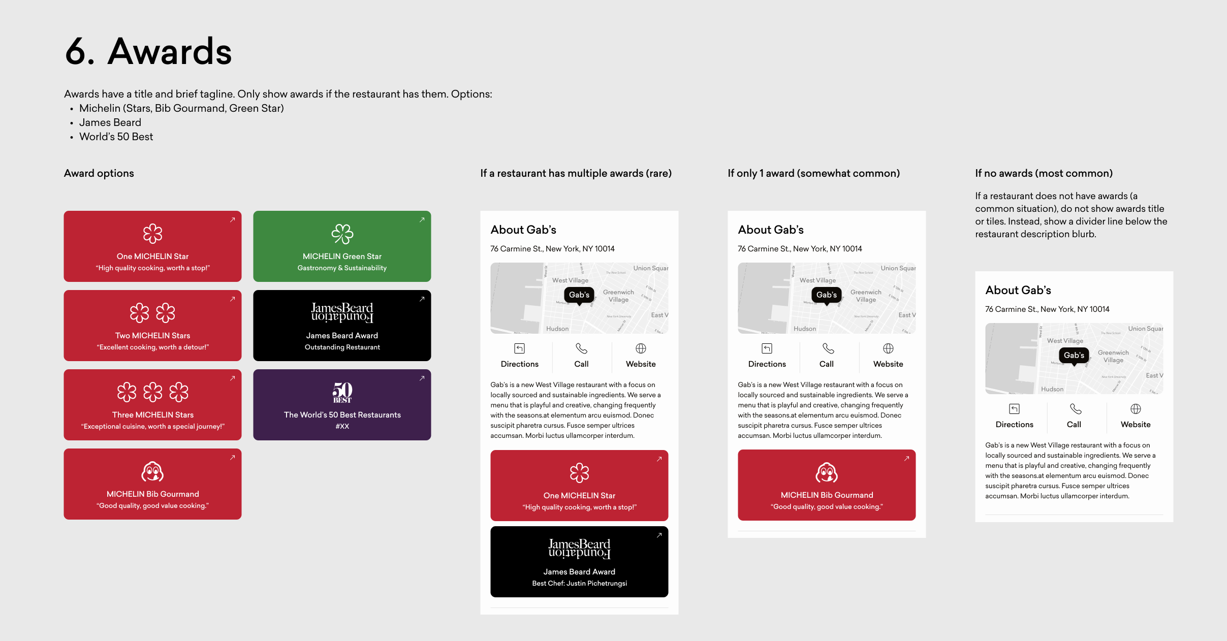
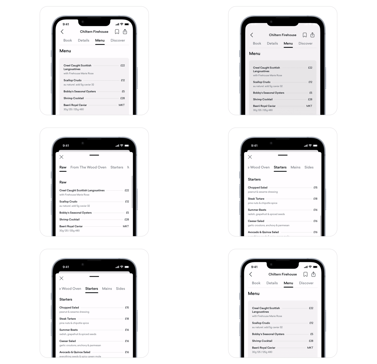
Flexible Modules for Menus, Awards, & Content
Due to the range of information available about our restaurants, it was crucial for the profile to gracefully degrade when restaurants lacked components like menus, awards, and editorial content. We designed each module independently and intentionally considered various conditional states by removing sparse descriptions, mixing Dorsia content with press features to obscure any lack of coverage, and redirecting to seasonal menus when available. This way, the Dorsia restaurant profile could uniquely highlight the strengths of a restaurant and resist feeling “empty.”
Still, the design ensures architectural consistency in the sticky navigation. Always a maximum of four links, they direct the user to key informational points and highlight booking.
Key Quality
An “IYKYK” Angle
From the marquee of cuisine and vibe tags to in-app menus and the fun fact footer, the Dorsia restaurant profile emphasizes its exclusive and curated access to its venue partners. Designed to show off our inventory in ways that competing platforms like Resy and OpenTable can’t, users can discover a venue through a Dorsia-specific lens, inspiring a sense of intimacy with the brands. Our editorial and luxury in-the-know angle is a key value proposition, so we wanted this to sing in the UX.
Project Takeaways
The Power of Assumptive Journey Mapping
Due to concerns around member privacy and fast launch timelines, our team relied on a preliminary journey map based on inferred insights to drive problem framing and design focus areas. This helped us stay agile while better understanding our knowledge gaps, for which we were then able to defer to quantitative usage data.
Design for Graceful Degradation
Our inventory of 120+ restaurants was inconsistently covered in our database, with some containing more context than others. To ensure design resilience, we prioritized core points of information in the UX and creatively reconceived any “empty” states. Especially when working with inputs of varying informational quality, scalable solutions are crucial.
The Importance of a Facelift
This project was a major quality-of-life improvement, integrating basic functions like menus, bookmarking, and press features. It was also an aesthetic revisioning and branding moment. After one year of being out in the wild, Dorsia’s booking velocity was beginning to plateau. Simple table stakes features and repackaging the beauty of our house of brands proved crucial for conversion.